Xoanquay
Hiệp Heo Nhân Ái
That's quite normal.Clm lên xàm học cả ielts
That's quite normal.Clm lên xàm học cả ielts
Yeah, my tu👍yết ít i, nai tu mít diu my fen Hiệp Đen đẹp zai khoai to
Hi my friend, which one you prefer?yết ít i, nai tu mít diu my fen Hiệp Đen đẹp zai khoai to

văn viết Ai Eo đéo gì giống văn tao chửi thằng sếp ngu lol tao vậy màyWhat's up Xammer!
I have stopped at the day 27 in my Nofap process. What I realize is that Nofap is great for those who are addicted to porn, not for me.
So, looking back at my recent goal, I decide to create this topic to track my record on learning Ielts writing.
One of the reasons I want to make my progress public here is to encourage xammers to wake your asses and study the language with me. Furthermore, getting commented from others makes me feel quite connected.
Let's get fucking started.
P/S: I gradually update my writing later on.
ai ôn ly lai ma tuys đu diu have any ma tuys ko??Hi my friend, which one you prefer?
Du du lai indica ?ai ôn ly lai ma tuys đu diu have any ma tuys ko??.png "Sex :vozvn (7):")
nâu ai đôn, ai lai kẹo ke only. weed is for cow and búp pha lôDu du lai indica ?
@Trâu Lái Xe 🤣😂🤣nâu ai đôn, ai lai kẹo ke only. weed is for cow and búp pha lô
Anh Hiệp Black cũng học Inh lít ạ?
Anh mới mua sách về tự học em giai ạ.Anh Hiệp Black cũng học Inh lít ạ?
Hi, vc stands for vancouver a city in Canada not vãi cặc. 🤣😂🤣Ai uyn ne vờ thinh dát oăn đây ai uyn xờ ta đi inh líc ất xàm vi en chấm vãi cặc
bài nài chắc dc ~6 ahh.. nếu bỗ sung thêm thông tin vs bõ mái cái tự suy diển za có thễ dc 6.5The chart (this is a table, not a chart) shows the number of international visitors of five areas from 1990 to 2005.
Overall, the number of international visitors had the tendency to increase over the period. Europe was often (I am not sure about the often here) the most visited area while Africa and Middle East took the least proportion of total tourists share.
(Very good overall, you have described the overall trend and made 02 comparisons. Good in complex sentence)
In 1990, Europe attracted over 280 million visitors from all over the globe. The area was among the best choices of people due to its old architectural buildings, as well as well-preserved natural landscape (Do not try to be a smart ass here, this information is irrelevant to the given table). America was the second popular area with 80.5 million tourists and followed by Asia and the pacific with about 60.2 million. Africa and Middle East shared the least amount of international visitors, with only 18.2 and 9.8 million respectively. (To improve this paragrapth, you should add one or two comparitions here, for example: The international tourists of the American was higher than that of Asia and the Pacific, 80.5 million compared to 60.2 million respectively.
In the next 15 years, while Europe still maintained its position, Asia and the Pacific quickly took over the second most attractive area and reached 135.8 million tourists in 2005. America, in the other hand, did not show any improvement in tourist attractions (good notice). This probably due to the fact that Asia and the pacific had the advantage over America as most of the countries in this area were still considered as third world countries, so the tourism cost was much more affordable for global travellers. (Do not make assumtions, the task does not ask you about it !!!!) Additionally, in America, especially the US and Canada, most of its budget was saved for researching and developing advanced technology, so financial spending for tourism attraction was likely
to be cut off. (Same here!!!). Can add the data of Africa which is the number of tourists increased significantly, nearly doubled in 2005 compared to 1995
Tao vẫn chưa phải chuyên gia nhưng tao đoán mày đang ở band 5.5-6.0. Bài này mày có overall tốt nên có thể lấy được band 6.0. Trong 2 đoạn 1 và hai mày cần thêm các yếu tố so sánh và sử dụng thêm câu phức để tăng điểm. Mày thêm quá nhiều yếu tố thừa thãi mà task nó không hỏi trong cả hai đoạn văn. Thêm vào thế tao đảm bảo mày bị giáng xuống 5.0 hoặc 5.5 vì ảnh hưởng đến task archivement
Tip của tao là mày tìm criteria của IELTS task 1 mà đọc kỹ vào, câu phức và các cấu trúc so sánh cực kỳ quan trọng để lấy band 6.5
Mong các cao nhân khác góp ý thêm
Dạ anh, thanh kiu, ai ăn đờ xờ ten.Hi, vc stands for vancouver a city in Canada not vãi cặc. 🤣😂🤣
Tao viết ai eo đây nàyvăn viết Ai Eo đéo gì giống văn tao chửi thằng sếp ngu lol tao vậy mày
Đây nữa nàyYou should spend about 20 minutes on this task.
The chart below shows the amount of money given to developing countries from five organisations from 2008 to 2011.
Write a report for a university lecturer describing the information shown below.
You should write at least 150 words.
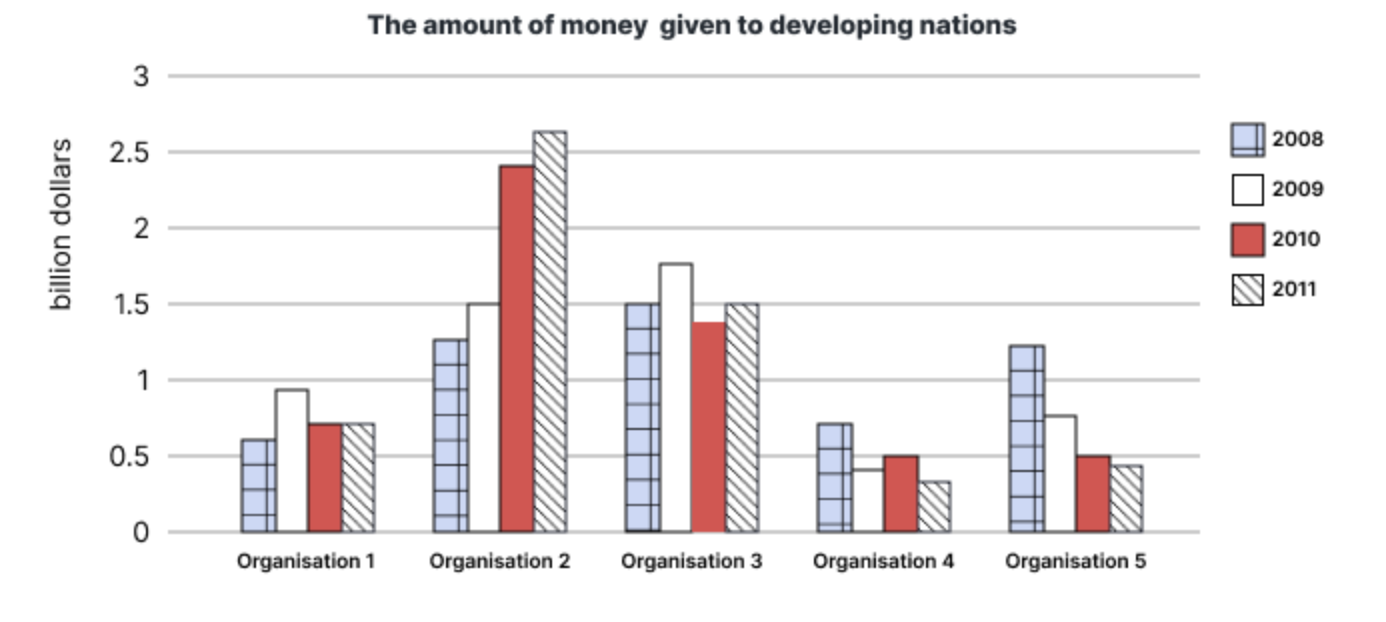
The graph demonstrates the allocation of financial support from different organizations given to developing nations throughout the period of 2008 to 2011.
Overall, while organization 2 had the tendency to donate more money to developing countries, the remaining organizations either maintained their contributions or gradually decreased them.
In 2008, organization 3 led in financial support to third world countries, providing about 1.5 billion dollars. Organization 2 and 5 followed as the second-highest contributors, with approximately 1.25 billion dollars each. In contrast, the other organizations were observed far left behind, with only about 0.75 billion dollars donated.
In 2009, while organization 1, 2 and 3 supported more money, organization 4 and 5 had cut their financial aid by nearly 50%. Also this year, organization 3 still maintained to be the top donor with an allocation of nearly 1.75 billion dollars.
However, by the end of 2010, organization 2 experienced a substantial increase in the amount of donations, surpassing all others to become the largest contributor. It continued to escalate the total amount of money, reaching over than 2.5 billion dollars by the end of 2011.
@TatHuan
The table shows the total number of international visitors in five areas from 1990 to 2005.
Overall, the number of international visitors had the tendency to increase over the period. Europe was the most visited area while Africa and Middle East took the least proportion of total tourists share.
In 1990, Europe attracted over 280 million visitors from all over the globe. America was the second popular area with 80.5 million tourists and followed by Asia and the pacific with about 60.2 million. Africa and Middle East shared the least amount of international visitors, with only 18.2 and 9.8 million respectively. It is noticeable that Europe had more tourists than the other four combined.
In the next 15 years, while Europe still maintained its position. America, in the other hand, did not show any improvement in tourist attraction. The region only observed an increase in the 1995 with 112.5 million, then it slightly fluctuated around this mile stone for the next 10 years. As a result, Asia and the Pacific quickly became the second most attractive area due to its amazing increasing pace. In this period, this area had attracted more than double total travellers, to 135.8 million. Middle East and Africa did show minor improvement, reached 15.8 million and 28.7 million tourist attraction respectively.
@horus tao viết lại rùi nè mày
Lớp đéo gìthêm lớp speaking nữa đi m
)") ) t đéo có nhu cầu dạy dỗ ai
) t đéo có nhu cầu dạy dỗ aiViết rồi quăng lên chat gpt, trên này cũng có cao nhân lâu lâu xuất hiện như tml @horus @suchawandererCó gửi bài cmay chữa đc ko
Tao chuẩn xammer cặc to đụ daiđây là vốt zơ trà trộn rồi chứ k thể nào là xàm mơ dc.png "Sex :vozvn (24):")
@đéo có hình chó nó tinLớp đéo gì
Viết rồi quăng lên chat gpt, trên này cũng có cao nhân lâu lâu xuất hiện như tml @horus @suchawanderer
Tao chuẩn xammer cặc to đụ dai
Lớp đéo gì
Viết rồi quăng lên chat gpt, trên này cũng có cao nhân lâu lâu xuất hiện như tml @horus @suchawanderer
Tao chuẩn xammer cặc to đụ dai

T thấy nhiều thằng khi viết khi nt để cái chữ well này phía trc. Nó có ý nghĩa là gì vậy mwell , i’m a big fan of this toppic
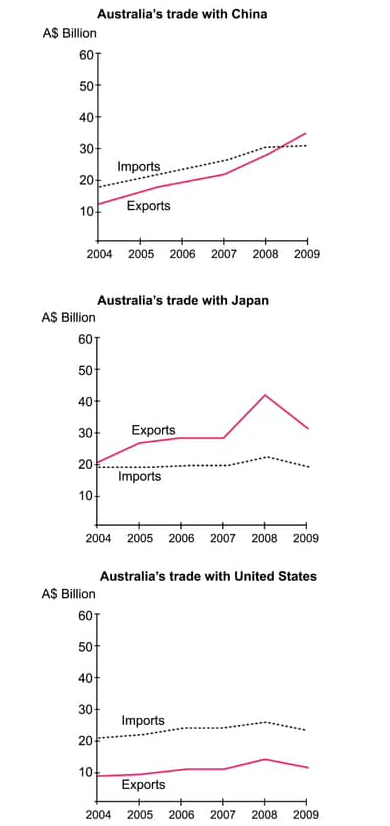
'on the other hand' nha mài..#3. You should spend about 20 minutes on this task.
The three charts below show the value in Australian dollars of Australian trade with three different countries from 2004 to 2009.
Write a report for a university lecturer describing the information below.
You should write at least 150 words.
The three graphs demonstrate the trading amount of Australia with China, Japan and the US between 2004 to 2009, measured in Australian dollars
Overall, Australia's export volume increased at a faster pace than its import.
In 2004, Japan led in total trade value with Australia, with the combined value of imports and exports reaching around 40 billion dollars. China and the US had nearly equal total amount of trade, each at approximately 30 billion dollars. The US had the highest total imports, exceeding 20 billion dollars, while Japan was the highest exporter, exporting 20 billion dollars worth of products.
In the next five years, China's trade with Australia grew rapidly, making it the largest trading partner, with the total trade value exceeding 60 billion dollars. The US, in the other hand, had its trade volume remained relatively stable throughout the period. Notably, Japan experienced a significant increase in imports in 2008, reaching an all-time-high of over 40 billion dollars. However, the total amount of imports remained roughly the same at 20 billion dollars.
@horus @suchawanderer @TatHuan
Tao bí đéo biết bổ sung gì thêm á mài'on the other hand' nha mài..
bỗ sung thêm overall